Good Enough For POLAROID, Good Enough For Me
I used to attend the Wilson Hicks Photojournalism Conference at the University of Miami every year. It was a great place to stimulate my brain, learn new things, and make contacts. One year around 1970 I met a woman who was in charge of advertising and public relations for a Miami based computer company, Milgo Electronics. They made a remarkable new product called a modem so computers could talk to one another over the phone. Computers back then were huge things, filling a room. They stored information on big rolls of 3.5 inch wide magnetic tape, and you put the information into them with punch cards.
Try as I might I can't remember that woman's name, but I remember she and I going to lunch one day with the graphic designer they'd hired to design some ads and brochures, Jon Craine. He was the man who'd recently revamped the image of the Polaroid Corporation with new ads, new logo, and package designs. Jon asked for one of my cards, and the first thing he said was that he didn't like it. He then proceeded to give me a whole bunch of reasons. One was that he didn't like the use of the European style 7 with the line through it. At the time it was seldom seen in the United States, although it's since caught on. He just said it was confusing!
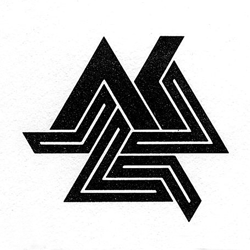
He offered to design a new logo for no charge so I took him up on it. A quick sketch on a napkin revealed a stylized AK, my initials, repeated three times into a star pattern. I liked it! A few weeks later I received the completed logo in the mail along with a camera ready layout for new business cards, invoices, and letterheads. I've been using it ever since. Thanks, Jon
posted by Al Kaplan at 12:33 PM
![]()
![]()

0 Comments:
Post a Comment
<< Home